Project 6: Stationery

SnapshotSnapshot2Snapshot3.jpg

  1. Description: A letter Head and matching business card design.
  2. Process (Programs, Tools, Skills): I used Adobe Illustrator to created the simple camera design by using the shape tools and the rotate tool to create the aperture logo inside of the lens. I then moved it to Adobe In Design and created these layouts.
  3. Message: I wanted a simple and understanding message spread across a large audience
  4. Audience: A large audience that could range from 16-55 anyone who could use a professional photographer.
  5. Top Thing Learned: The rotate tool and how it works and how to create a perfect circle.
  6. Color scheme and color names: Black and white. Monochromatic I felt that added color would distract as cameras are usually black.
  7. Title Font Name & Category: SnappyService
  8. Copy Font Name & Category: Rokkit

Project 5: Logos

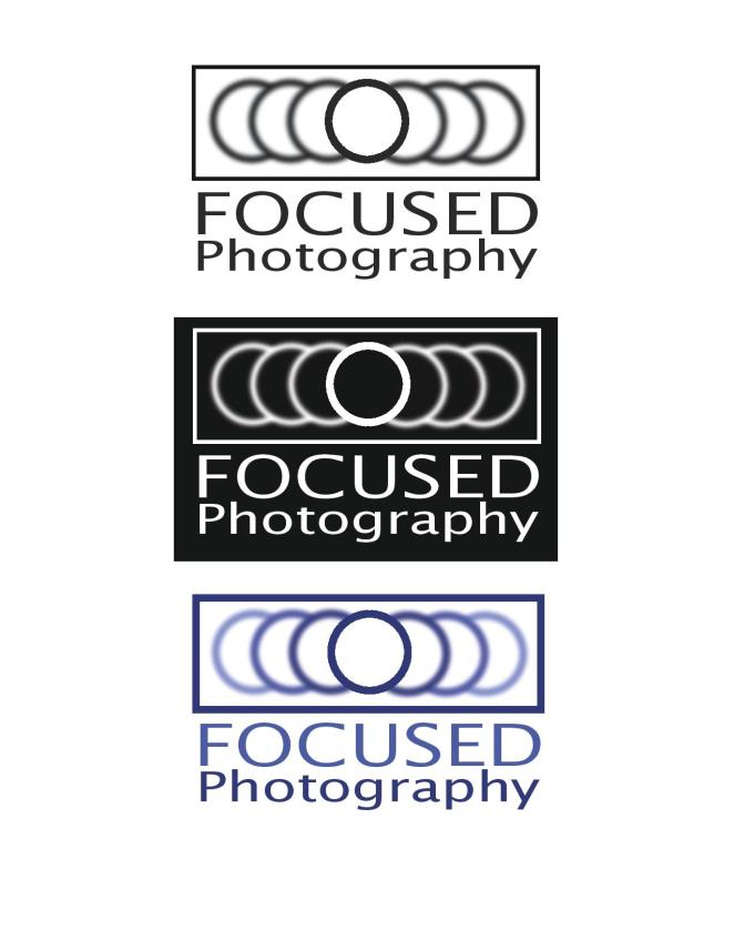
Three designs final-page-001

  • Description: Logo for a photography business.
  • Process (Programs, Tools, Skills): I used Adobe Illustrator to create this simple logo. I drew a simple circle and copied it 6 more times. After this I used Guasian Blur effect on the circles to create a simple image if the circles being lost in the background. After words I simple added a a small box around the circles to frame everything like a photo.
  • Message: That the company Focused Photography gets the message that you want right on point. 
  • Audience: 18-35 looking for a professional imaging company.
  • Top Thing Learned: Illustrator is difficult to use but not impossible and is needed to design amazing things.
  • Color Scheme and Color Names: Monochrome color scheme. Blue 

Project 4 Montage

p4NathanFLeming

  1. Description: A simple poster to inspire people to create.
  2. Process (Programs, Tools, Skills, Steps taken while designing)I began by selecting the images that I wanted to use and laying them ontop of eachother and started fading them away using masking layers. I wanted my images to stand out and create something powerful so I picked images with unique and diffrent colors all while matching the color scheme that I selected. After mixing the pixels together I created the typography using two fonts and used the wonderful quote from dieter f. uchtedorf.
  3. Message: That anyone can create.
  4. Audience: 16-25 students
  5. Top Thing Learned:  The brush tools and quick keys in photoshop.
  6. Filter / Colorization used and where it was applied:  Color balance, and vibrance added to the back canvas background image.
  7. Color scheme and color names: analagous, yellow, gold, brick
  8. Title Font Name & Category: Painted and Songi ti
  9. Sources (Links to images on original websites / with title of site):  http://www.textures.com/download/fabricplain0035/3153?q=canvas                                                                                                                                               https://images.unsplash.com/photo-1457463658343-253a25d7dce3?ixlib=rb-0.3.5&q=80&fm=jpg&crop=entropy&s=f7a6e2332d3df5584c22d11919c15d22,%20https://images.unsplash.com/photo-1457463658343-253a25d7dce3?ixlib=rb-0.3.5&q=80&fm=jpg&crop=entropy&s=f7a6e                                                                                                                                                                                               https://images.unsplash.com/photo-1459908676235-d5f02a50184b?ixlib=rb-0.3.5&q=80&fm=jpg&crop=entropy&s=9c71ef5c01c6c25495352a3f04628dbd,%20https://images.unsplash.com/photo-1459908676235-d5f02a50184b?ixlib=rb-0.3.5&q=80&fm=jpg&crop=entropy&s=9c71e                                                                                                                     http://www.startwoodworking.com/sites/default/files/uploads/171/3831/handplane.jpg

Project 3: Photodesign

Soul Music

  1. Description: This was an image to demonstrate my photography skills combined with my ability of design in Photoshop.
  2. Process (Programs, Tools, Skills, FOCUS principles): I used Photoshop CC to edit my photo that I took with my Canon 60D. The lense i used was a 18-55mm F3.5-5.6. Focal length was 38 mm, ISO 400, Shutter Speed 1/250, and F4.0. I made simple  edits using sharpening tools, levels, hue and saturation, and selective color. After editing the image I cropped it to fit my 11 x 8.5 layout. And began creating a color scheme trying to bring out the color of the wood on the bottom of the pipes and the faint teal color between the pipes formed by the light refracting.
  3. Message: The message I want to share was simple. That music can influence everyone and people need to appreciate it.
  4. Audience: My audience is college students who struggle to understand the wonderful blessing of classical music.
  5. Top Thing Learned: Focus, Focus, Focus. You need to make sure that your image in focus cause if it isn’t every single edit you make points out your error even greater.
  6. Color scheme and color names: Split complementary: Teal, Red, and Orange.
  7. Title Font Name & Category: Mochary: Script
  8. Copy Font Name & Category: Vollkorn Regular: Oldstyle

IMG_4775.JPG

5/17/2016 Taylor Chapel, Brigham Young University Idaho, Rexburg, Idaho

Project 3 Activity: Photography

Outdoor LIghting

Light 1 : OutsideIndoor Lighting

Light 2 : InsideForegroundFocus 1 : ForegroundBackgroundFocus 2 : BackgroundRule of ThirdsComposition 1 : ThirdsLeading Room_NFComposition 2 : Lead Room

The photos I took today were taken on a Canon 60D. The lens I used was an 18-55 F3.5-5.6 and I used natural lighting. Understanding composition is a powerful aspect in photography. It allows a beginner to turn images into something that is professional level or close. It teaches people how to see the world in a different view.

I want people to understand that even a beginner can take amazing images if they take their time to focus and really put into work these aspects. I understand that we must take time and practice these elements. Once we try and practice our hard work will convert into something more positive.

Emily & Torri


Models- Emily Montgomery (Black Dress)                                                                                                                 Torie Derrick (Grey Dress)

Location- Sportsman Park, Idaho Falls

Equipment Used- Canon 60D, Canon Lens 35-70 F3.5-5.6, 48 inch gold reflector

Project 2: Event Ad

Save the ruins-page-001

  1. Description: This is an ad for a charity dinner to support newly discovered ruins.
  2. Process (Programs, Tools, Skills, FOCUS principles): I drew several sketches of what I wanted. After that I opened the 2011 version of Microsoft Word and began designing this flyer. I used text boxes to make sure everything is aligned properly. After making sure it was aligned I edited the the photo to make sure the font was legible against the dark background.
  3. Message:  The message is to communicate the time and destination of a charity dinner.
  4. Audience: The aimed auidence is couples with intrest in preservation of historical ruins. The age group would be from 35-55
  5. Color scheme and color names: Monochrome color scheme. Color-Gold
  6. Top Thing Learned: Color schemes are difficult
  7. Title Font Name & Category: Bernard MT condensed
  8. Copy Font Name & Category: Helvetica
  9. Scanned images used, sources, original sizes, location of scanner used: The image scanned came from National Geographic- The photographs. Original size 6×8. Location of scanner is The scanner in the Mckay library Commons.

Project 1: Flier

p1aNathanFLeming

  1. Description: A black and white flier about a leadership conference for recent graduates.
  2. Process (Programs, Tools, Skills, FOCUS principles): I started by drawing multiple sketches of what I wanted. As I started working in InDesign one of my sketches started coming to life as I created the layout. Once I put in the text I began to rearrange the layout to fit everything. Once I finished my rough draft I had three people critique and help fine tune my design. After the critiques I made a few minor changes and ended up with my final project.
  3. Message: The message I am trying to send is the importance of leadership and where people can learn how to become leaders.
  4. Audience: My audience is recent college graduates age 19-26 that are in business or other professional careers.
  5. Top Thing Learned: Repeat key design aspects.
  6. Title Font Name & Category: Oswald-San Serif
  7. Copy Font Name & Category: Minion Pro-Old Style
  8. Links to images used in this project:                                           https://130.commbyui.org/wp-content/uploads/2013/01/JuliePeterson                              https://130.commbyui.org/wp-content/uploads/2013/01/VouantLogo2.png